Lack of consistency
Each module had been designed at a different time with its own patterns, its own components and its own logic. Nothing added up to one product, and users had to relearn the interface every time they switched tabs.
1/3
UX Research · Competitive Analysis
Information Architecture
Interaction Design · Design Systems
Prototyping · Client Communication
FormaCar is an automotive super-app: a 3D car configurator, a marketplace, a social network and a tuning catalogue in one product. The client came to us to restructure the UX, redesign the application and add new features. I worked in a team of three designers, and ran research, analysis and UX/UI design myself.
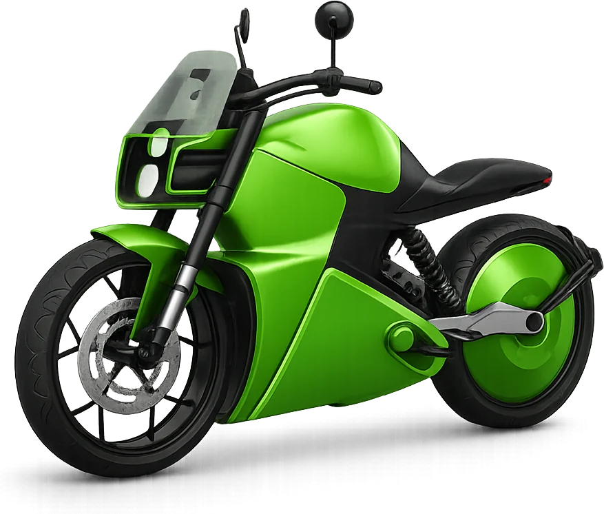
FormaCar had built four modules over several years, each one solving a real job for car enthusiasts. Configuring a car in 3D, buying and selling, talking to other owners, browsing tuning parts. The problem was that it had been built as four products that happened to share a login.
We started with analysis: what makes the application less user-friendly, what could be done better, is it modern enough. After auditing the existing app, studying competitors and interviewing the target audience, we built four personas and identified the areas that had to be solved.
Key identified areas
Lack of consistency
Each module had been designed at a different time with its own patterns, its own components and its own logic. Nothing added up to one product, and users had to relearn the interface every time they switched tabs.
Poor application logic
The modules did not talk to each other. A seller could not show the 3D configuration of the car they were selling; a community member could not see another enthusiast’s garage.
No design system
Every new screen was drawn from scratch. There was no shared library, states were inconsistent, and handoff to development was slow and lossy.
We worked from personas outward. Four of them. A 41-year-old family car buyer, a 37-year-old sales manager who sells cars, a 29-year-old automotive journalist, a 22-year-old game designer who tunes his car. They gave us four different definitions of “useful”, and they disagreed with each other. The configurator mattered to one and was irrelevant to another. That disagreement is what pushed us toward a configurable home screen instead of one canonical one.
In parallel I set up the UI Kit early, before most of the screens existed, so that the three of us were drawing from the same components rather than converging at the end.
Key introduced features
Editable home screen with widgets
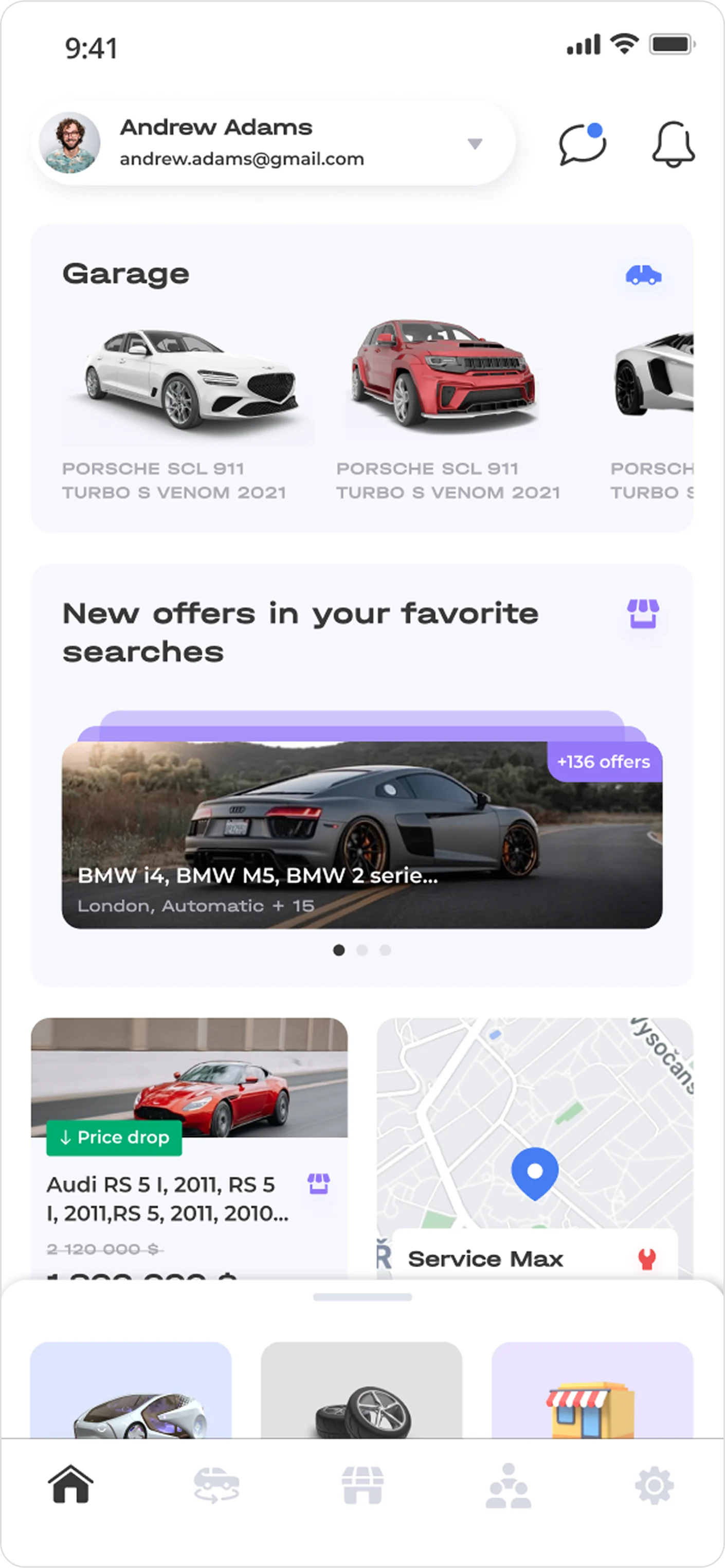
A single entry point to all services. Configurator, Market, Community, News, Car services, Catalogue, Chat — where the user adds only the widgets they actually use.
Connected modules
Market linked to Configurator, so a seller can attach a 3D model to a listing. Market linked to Community, so offers appear on the seller’s profile. Community linked to Configurator, so users can look inside each other’s garages.
Design system
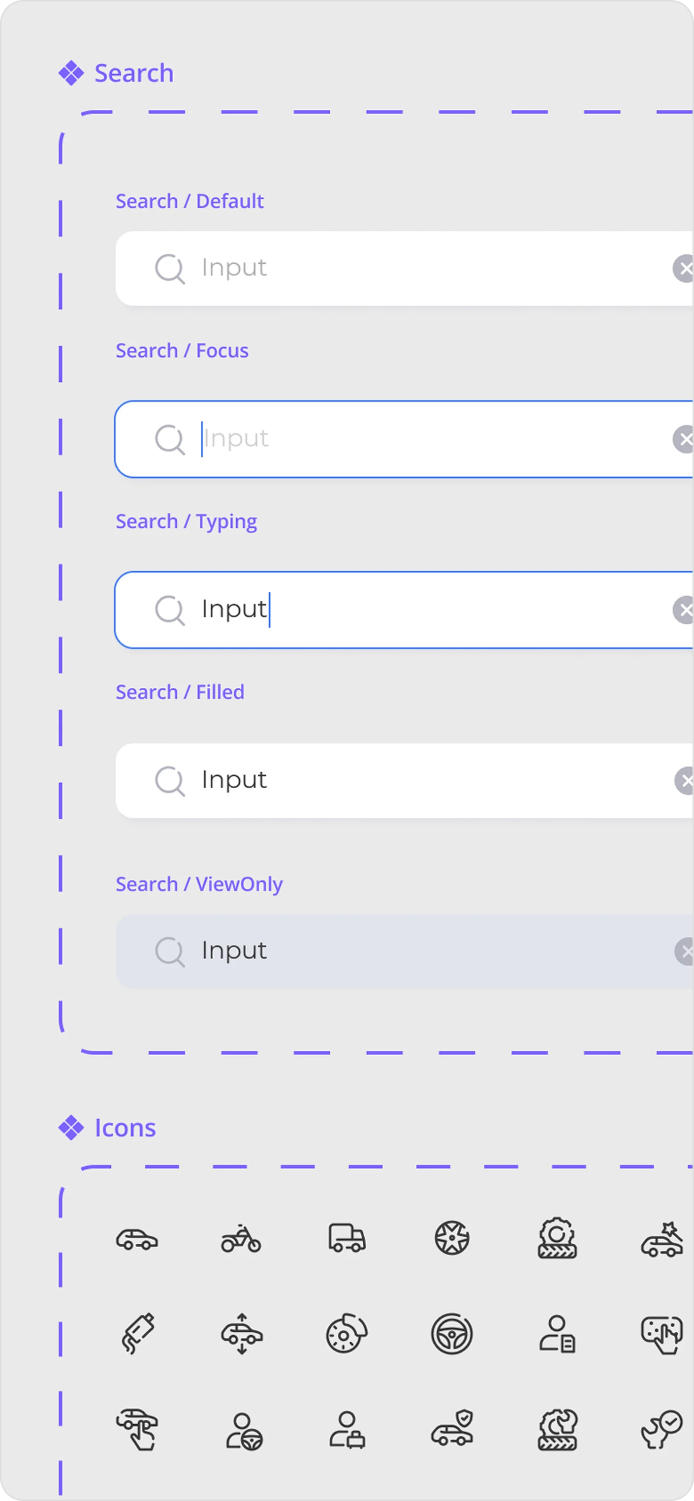
A full component library with all functional states, which let us scale screens quickly and gave development a single source of truth.
Dashboard
Design system
"I want to play with the car, not fill in a form." - persona: Mark, 22, car tuning
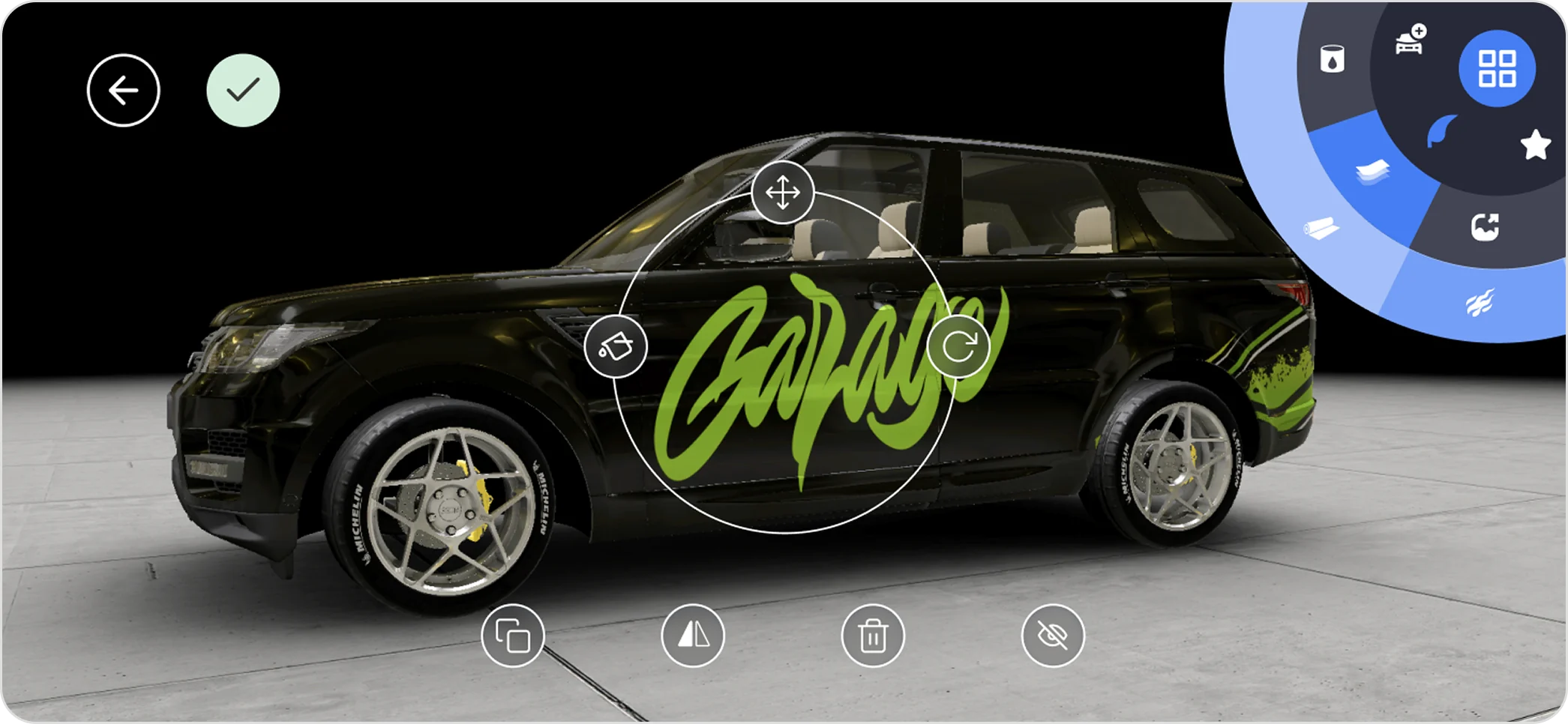
A circle menu instead of a toolbar in the configurator
The configurator exists for entertainment as much as for utility, and a conventional toolbar made it feel like a settings screen. We built a radial menu with three layers that rotates under the thumb. The reachable one-handed in landscape, and closer to a game than to a form. Modification controls sit on a bottom rail so the car itself is never covered.
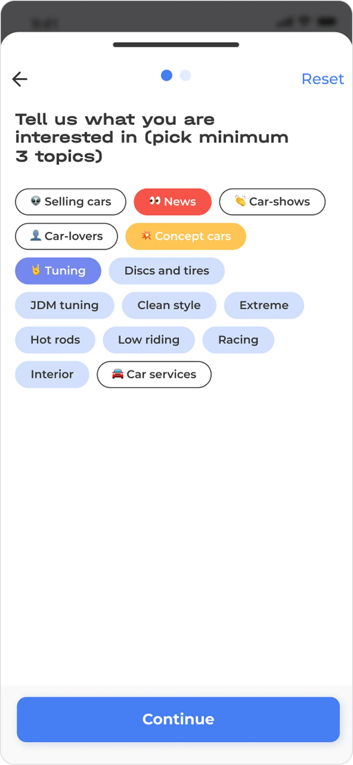
"I don’t know what I like to read about." - persona: Andrew, 37, sales
Interest-based onboarding for community
A social feed with no signal is empty on day one. We ask new users to choose at least three automotive interests before entering, which gives the feed something to show immediately and gives us the personalisation data without a separate settings screen.
The project ended with a new product logic and a new visual identity for FormaCar, delivered together with the brand assets and guidelines the client needed to keep building on it.
New information architecture
Building the informational and navigational architecture determined what the product would contain, which functions had to be founded and how users would move between them.
We set the priority and placement of elements on every screen and gave each module one consistent entry point instead of four.
Design system and brand assets
A full component library with all functional states, plus the brand assets and guidelines for the application. It let us scale new screens quickly across four modules and three designers, and it is the deliverable the client could keep using after we left.
Design and development alignment
The design system gave development a single source of truth, which cut the time spent rebuilding components and re-explaining states. This turned out to be one of the main outcomes of the partnership.
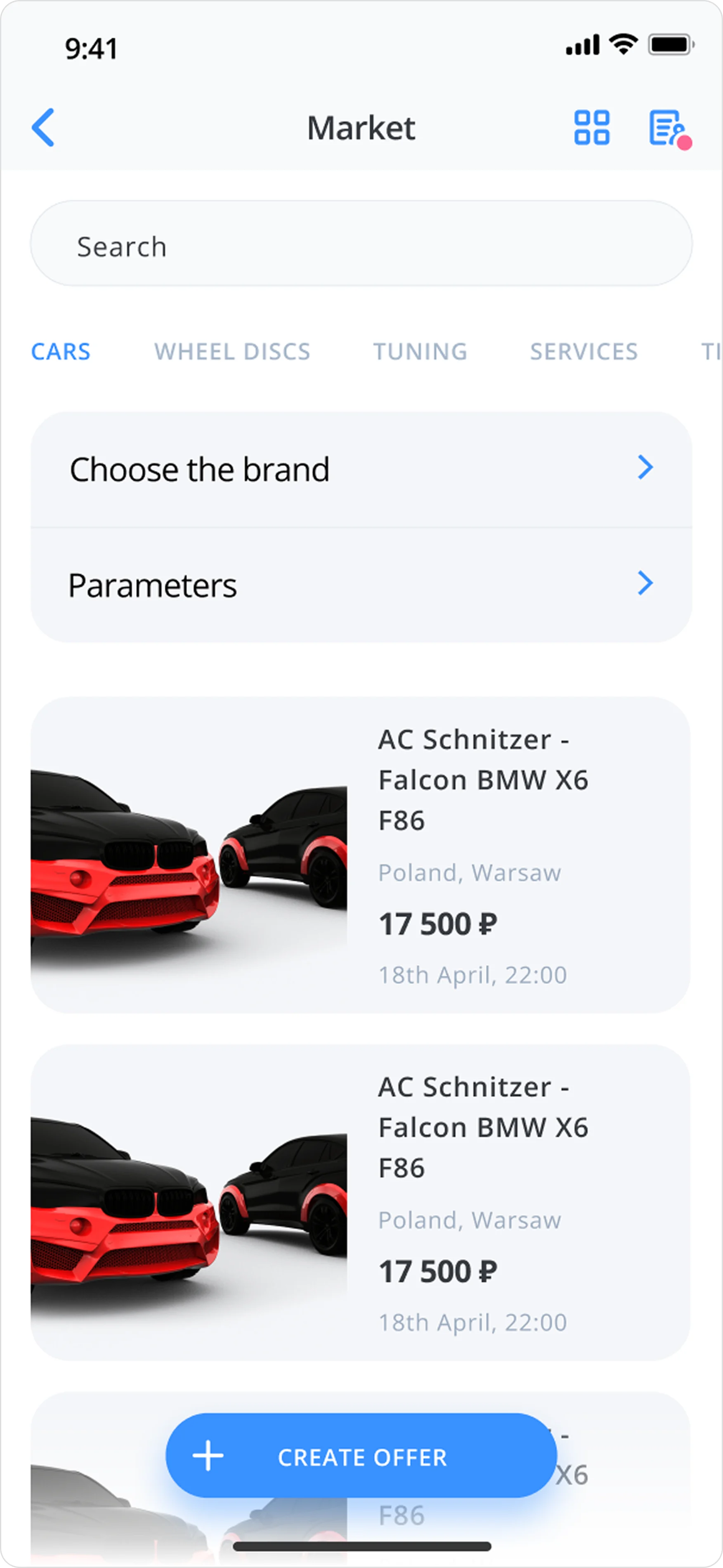
Market before
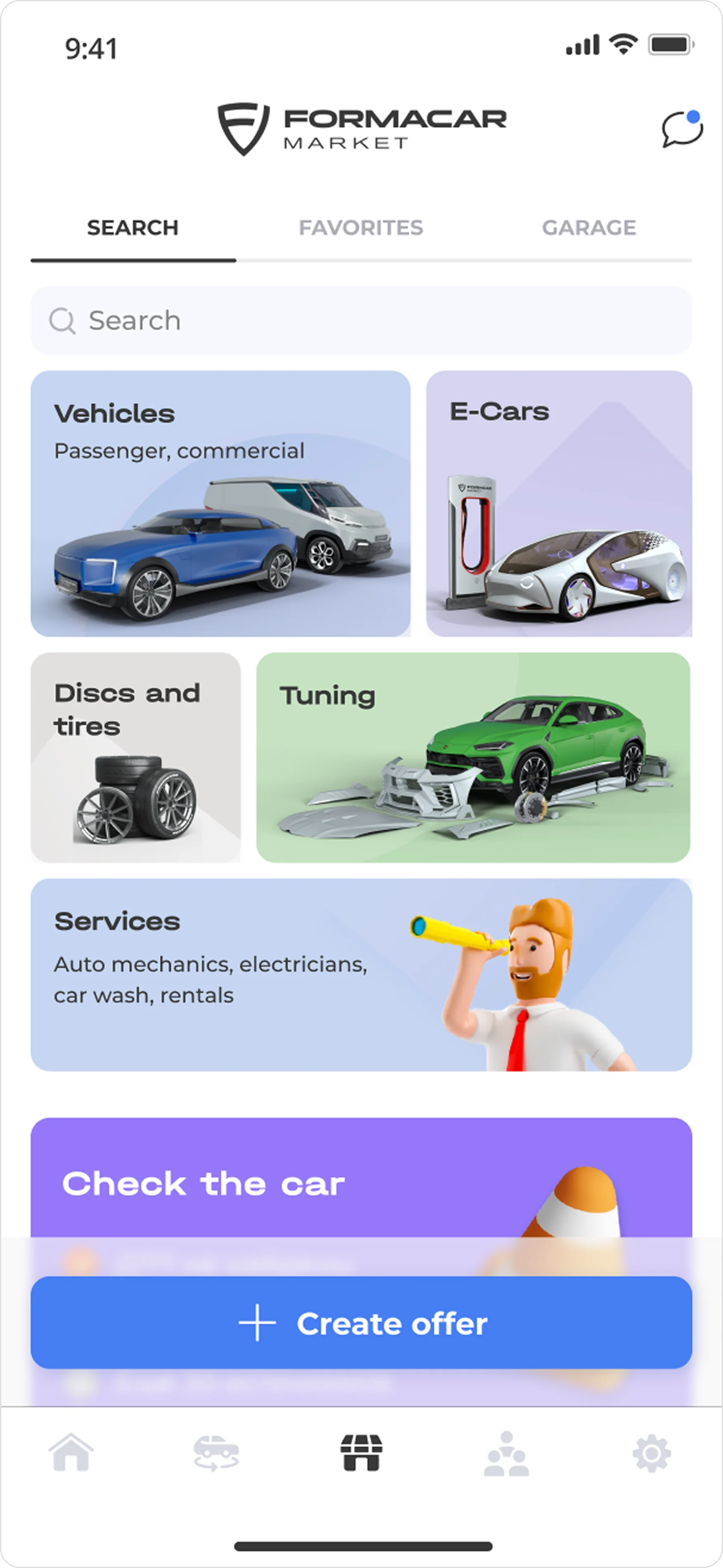
Market after
What I learned
This was the first project where I was working for external client with other designers rather than on my own, and the lesson was that a super-app is a systems problem before it is a screens problem.
The design system turned out to be the single highest-leverage thing we produced: it is what allowed three designers to work in parallel without the product falling apart, and what sped up handoff to development.
What I would do differently
We shipped on the client’s conviction and on our own analysis, with no validation loop. There were no usability sessions after the redesign and no metrics agreed before it, so I can describe the decisions but not prove them.
Today I would insist on two things before starting: a tracked baseline on the old app, and a round of testing on the configurator and the Garage specifically, since those two carried the most new interaction.
I would also push back harder on “keep as much as possible on one screen” instead of designing around it.