Reputational risk
Fear that involvement with crypto would block access to mortgage.
1/3
User Research · UX Strategy
Brain Trust Facilitation
Information Architecture
Interaction Design · User Testing
Stakeholder Management
Designed a crypto trading module for the Partners Banka Super App, navigating high technical uncertainty and parallel integration of third-party constraints.

For Partners Banka, crypto is a strategic retention tool aiming at keeping capital within the bank's ecosystem rather than losing it to external exchanges.
Our target user was the "Crypto-Newbie" — a bank's client who finds standard exchanges intimidating.
Key identified areas
There was no separate discovery phase. The product owner and I built the first version of the flow, and from the second iteration on it went to "Brain Trust" — a cross-departmental review where whoever the product owner invites sees the work and pushes back.
We took what held up and set aside what didn't. All three barriers below came out of that room.
Reputational risk
Fear that involvement with crypto would block access to mortgage.
Cost anxiety
Fear being charged with unexpected fees just for activating the feature.
Volatility shock
Psychological discomfort from significant value fluctuations.
Transparent flow, zero dark patterns amidst regulatory complexity.
Business wanted one-click onboarding, but regulation made that impossible. My task was to make the unavoidable be user-friendly and work smoothly.
Key introduced features
Safebox blocks
Info cards addressing the mortgage myth directly. Users' engagement rate was higher in the testing sessions we ran. We'll follow up after launch.
Content reduction
Pre-onboarding instructions were cut significantly, while still providing necessary information. Session recordings showed users were spending more time on simplified screens vs the original.
Legal wall
Mandatory 10+ legal documents were restructured with an introduction of Progressive Disclosure. Sign button activates only after full engagement.
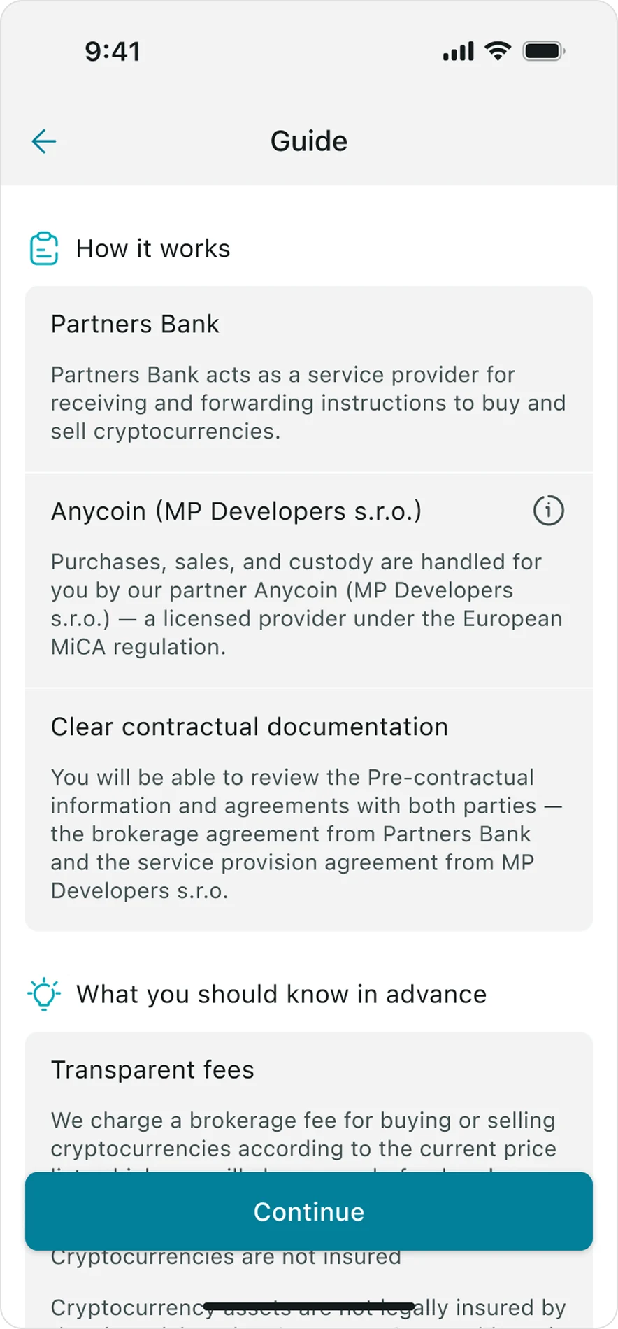
The constraints the design had to absorb
Third-party provider
The bank does not hold crypto itself — buying and selling run through a third-party provider, Anycoin, which shaped the interface more than any preference did.
Anycoin sets the rate and takes a fee, the bank takes its own, and both come out of the amount entered rather than being added to it — so 1,000 Kč buys slightly less than 1,000 Kč of bitcoin.
We show the two fees separately, so it is clear who charges what. Backend set the limits.
Settlement delay
A BTC order placed in our app is not settled by the provider at the same moment — it can sit in between for a while.
We knew about that gap from the start, and the transaction statuses are the answer to it: Pending, Realized and Cancelled exist because the money is genuinely in transit.
Engineering feedback
Our analyst turned all of this into the technical specification for frontend and backend, and frontend pushed constraints back the other way.
The BTC balance refreshes every five seconds, and my first version showed a three-dot loader on every refresh — on screen it flickered badly.
We replaced it with the figure itself animating smoothly to its new value, so the balance stays readable while it updates.
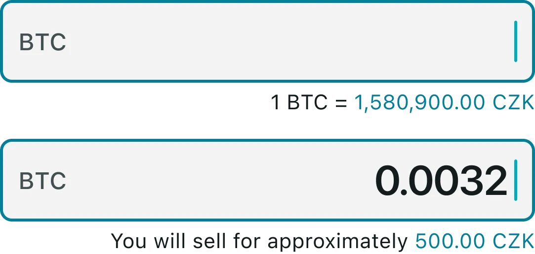
0.00032 BTC means nothing to someone who thinks in CZK.
Real-time exchange context
Selling requires BTC input.
An empty field shows current exchange rate; once the user enters the amount, an approximate CZK value is shown.
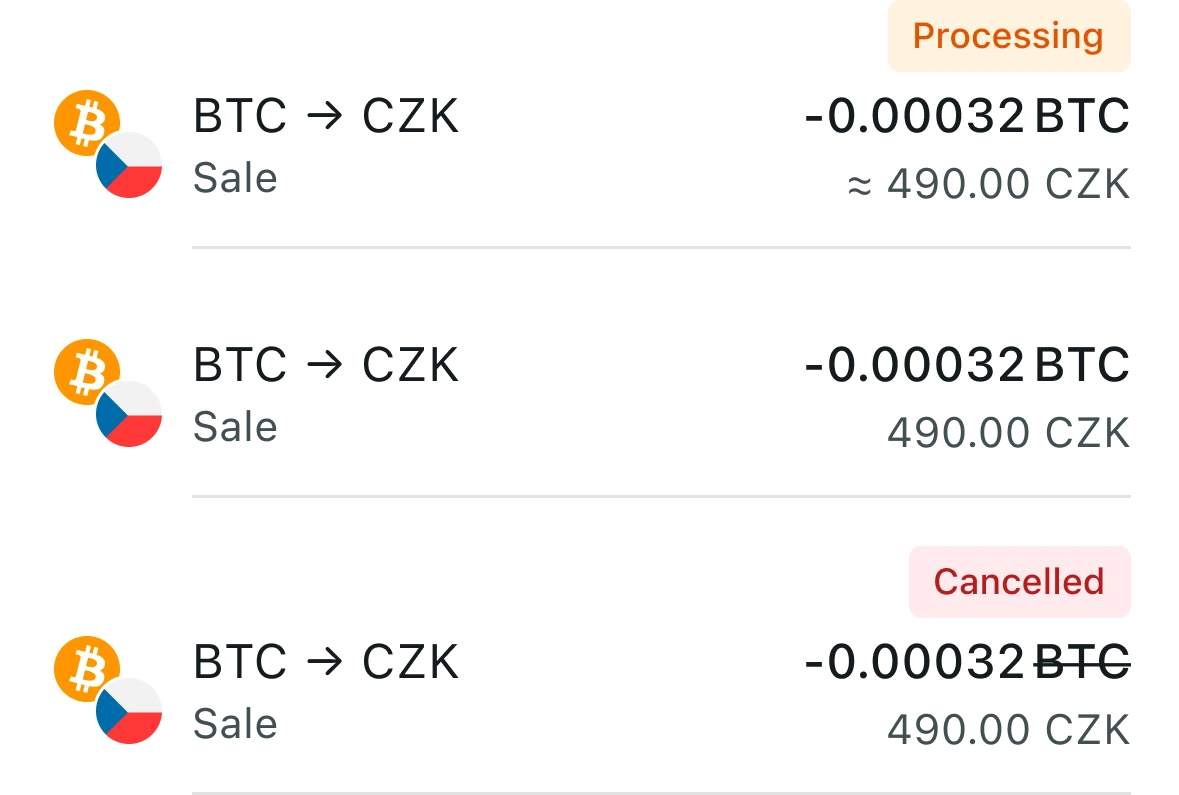
Where is my money right now?
Transaction status
Status indicators: Pending, Realized,
and Cancelled, give users a clear mental model where their money is at every moment.
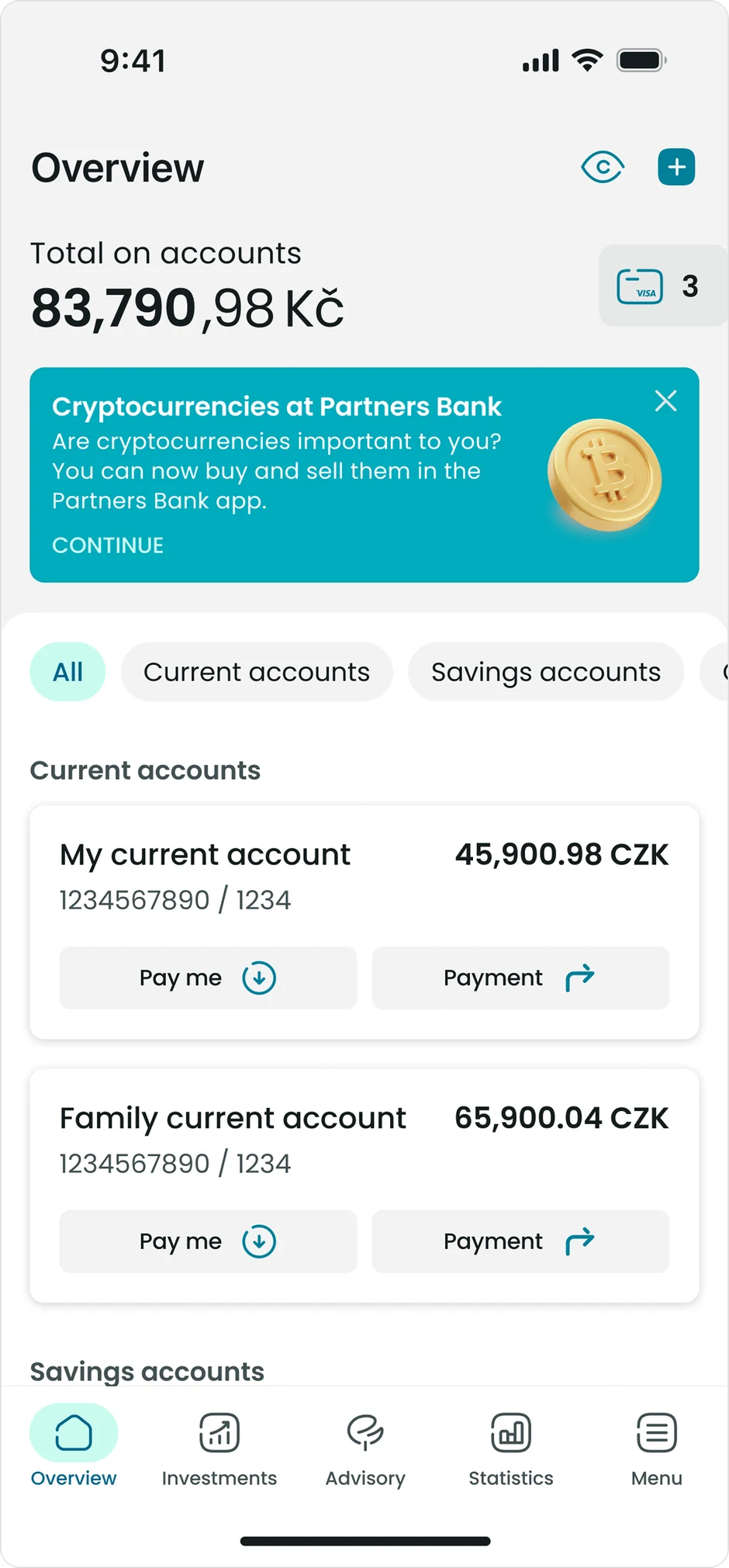
Initially crypto section was placed within the promotion banners section. During testing users instinctively looked for crypto section under Investments, not banners. This confirmed that banner blindness was real: passive promotion alone was not enough for a product that requires active onboarding.
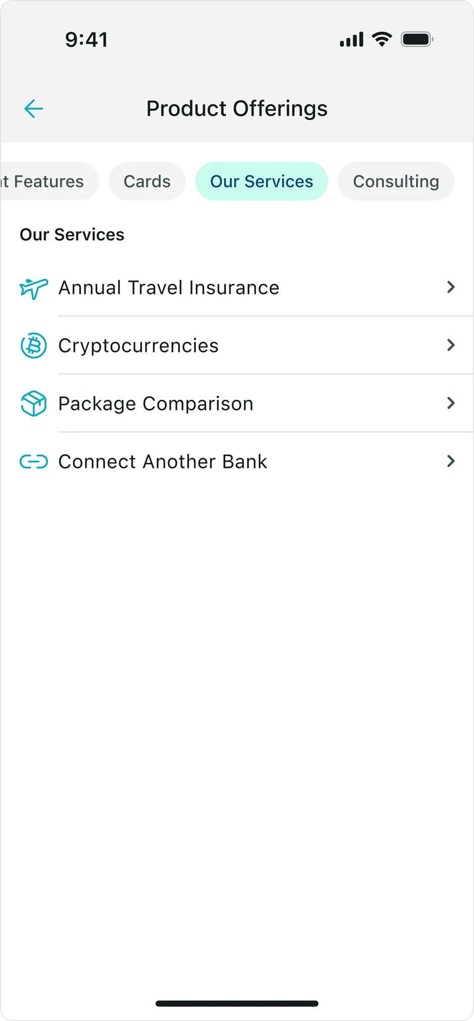
Crypto was added as a named entry in Offered Services section, which you can find through Menu. This made the section discoverable through conventional navigation. A contextual banner on the dashboard served as a secondary nudge for clients who haven't activated the feature yet.
A dedicated crypto tab in the main navigation pane is planned to be introduced as a part of the next major app redesign. Investments button will be replaced by crypto.
Abbreviation "MiCA" in the introduction section caused confusion. Contextual tooltips were added. Engagement will be tracked post-launch.
Showing risk disclosures earlier in the product engagement process was consistently rated as trust-increasing. This feature became a non-negotiable design principle.
Initial testing showed spike in anxiety without immediate fee display. After integration into main form, confidence scores improved across all tested segments.
The crypto module went live as an MVP and has been tracked in product analytics since launch.
Adoption was supported by a launch campaign, so the activation figure reflects the campaign and the flow together. A campaign can bring people to the entry point; it cannot carry them through 10+ mandatory legal documents and a first purchase — that part was the flow's job.
These are product metrics. The behavioural evidence for the individual design decisions sits in the testing section above.
Designing in the fog
There was no clear vision or fixed task in the beginning of the project. The regulatory constraints were only discovered halfway through the project. I had to make calls on legal-wall structure before Compliance has finished reviewing the doc set.
One conversation nearly changed everything
The mortgage fear was accidentally discovered during the first Brain Trust session with product managers. If nobody had mentioned it, we'd have delivered the product without the Safebox blocks addressing it directly.